Wednesday, 25 January 2012
Conclusion
I have thoroughly enjoyed this assignment as I appreciated the opportunity to study my own choice of fashion illustrators. I had to recreate and interpret the illustration styles of both Hanna Muller and Arturo Elena however I was also able to experiment and explore with my own style of illustration. I believe that the process of breaking down other illustrators work has helped me to understand their technique and improve my own illustrating skills which is a positive outcome. I am pleasantly surprise by the final illustrations which I have created and I look forward to using my new skills in the future. To conclude, I feel that my fashion illustrations have never shown any consistency in the past however as a result of this assignment, I believe that I may have found my own illustrating identity which should hopefully prove to be a valuable skill as I develop my career.
My Concluding Combined Illustration
After completing my practice version of my combined illustration, I am now more aware of how I can improve. For my practice illustration, I made a list of the features from both illustrators which I would like to blend together in order to create my combined illustration. On my previous list, I had chosen to use 4 elements from Hanna's style and only 2 elements from Arturo's meaning the illustration was obviously more representative of Hanna's work. For this illustration however, I have created a new equally balanced list for my next illustration as follows:
- Arturo's exaggerated body
- Arturo's captivating pose, including the use of a prop
- Arturo's formal clothing
- Arturo's sophisticated colours for the clothing
- Hanna's facial features, including glasses
- Hanna's monochrome skin tone
- Hanna's solid outline technique (to be used on skin tone only)
- Hanna's hairstyle
Once I had identified the elements that I wanted to use from each illustrator, I was able to proceed with my illustration and I again chose to complete a hand drawing before painting it using watercolours as I thought that this would give me a good basis before completing my digital work on Photoshop. My finished illustration is shown below and opted to use Arturo's iconic exaggeration on the body and I chose this particular pose because a lot of Arturo's illustration involve movement. I included the shopping bag because Arturo regularly uses props in his work so I thought this would be appropriate. I feel that the clothing and choice of colours are sophisticated and suitable for Arturo's style as he regularly pairs jeans with a dressy jacket on his own illustrations. I wanted to used Hanna's facial features as I felt that this would help to add a captivating and mysterious tone to the illustration. I decided to include the glasses as Hanna's illustrations are recognised by these unusual small details. I used monochrome tones for the skin tone in the same way as Hanna as I felt that this would create a good contrast between the coloured clothing, without looking like inappropriate and I finished the face by using Hanna's hair technique as I thought that her hairstyle were stylish yet classic meaning that this would help to complete the illustration.
 |
| My final combined illustration which was created using watercolour paints |
I am very pleased with my final illustration as I feel that it is one of the best illustrations I have completed throughout this assignment however, Arturo Elena creates a lot of his illustrations digitally therefore I would like to try this method on my own illustration. I am going to digitally enhance the drawing on Photoshop as I feel that this could allow me to improve the illustration. The digital process has been broken down below with written descriptions and screenshots provided where relevant.
I began by opening a new page in Photoshop, before setting up my paintbrush and smudge tool using the same technique as mentioned in my previous posts. More information regarding this area can be found in the third paragraph of the posting entitled ' My Own Illustration in the Style of Hanna Muller'.
After scanning my original watercolour illustration, I then opened the image in Photoshop and transferred it to my new page using the 'move' tool before creating a new layer. Using the same paint a smudge method which I used on my last few illustrations, I began applying different shades of coloured paint to both the jeans and jacket on separate layers, using my own original illustration as a guideline for the shading. I then used the smudge tool to blend the colour together until I was happy with the result as shown in the image below.
 |
| Screenshot showing the colour which was painted and smudged to create the jacket and trousers on my illustration |
I then proceeded using the same technique to add the shoes and the belt on different layers however I decided to change the colour of these items to brown as I felt that this was more appropriate for the other garments so I simply altered my paint colours to suit as illustrated below.
 |
| Screenshot which shows the belt and shoes which were adapted to a brown colour instead of grey as in my original illustration |
I created yet another two new layers before using the same method to create the jumper and the shopping bag however when finished smudging, I used the 'Add Noise' tool to create a speckled type texture which is illustrated in the screenshots below. I also decided to adjust the position of the shopping bag at this stage to make it look more realistic.
 |
| Screenshot demonstrating the 'add noise' tool which was used to create texture on the jumper |
 |
| Screenshot showing the 'add noise' tool which was used to create texture on the bag |
The next stage of the digital process was adding the outline to the skin tone areas including face, hands and ankles using the paintbrush tool. I also added the facial features and hair at this stage as shown below.
 |
| Screenshot which illustrates the facial detail and the hair which were simply added using the paintbrush |
The final stage of my illustration was the skin tone and I decided to use my previous technique which was using the smudge tool to blend my own original drawing on layer 1. This technique is shown in the screenshot below.
 |
| Screenshot showing the 'smudge' tool which was used to smooth the skin tone on my original watercolour illustration |
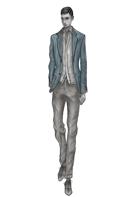
After completing all of the time-consuming digital work, my finished illustration is displayed below and I honestly could not be more pleased with it as I feel that it clearly demonstrates components from both of my chosen illustrators. I think that without doubt, this is my best piece of work and I am astonished with what I have been able to achieve using a mixture of my hand-drawn ability and my Photoshop skills. I feel that I have been able to achieve this result by carrying out my practice illustration as this really highlighted where I had gone wrong and thankfully I was able to correct these mistakes and I am extremely proud with my finished illustration.
 |
| My final combined illustration which was completed using watercolour paint and Photoshop |
My Combined Illustration - Practice
Now that I have completed an illustration in the style of each of my illustrators, I have decided to practice creating my final combination drawing which requires me to blend the style of both illustrators together in order to create my own unique style. I enjoy drawing male illustrations so I have decided to focus on this for my final combined illustrations. In order to complete this illustration I have made a list of the features from both illustrators that I would like to include as follows;
- Arturo's exaggerated body
- Arturo's formal clothing
- Hanna's monochrome skin tone
- Hanna's solid outline technique
- Hanna's facial style
- Hanna's hairstyle
To begin my illustration, I decided to use watercolour paint as after using it on my past two illustrations, I feel relatively confident that I can use this media successfully. My finished illustration is shown below and I like the outcome however I do feel that the style looks slightly more similar to Hanna Muller's but this is only a practice so I have an opportunity to correct these mistakes for my final combined illustration.
 |
| My final combined illustration created using watercolour paints |
Having used Photoshop to edit my last few illustrations, I am going do some work to this illustration also using the programme. I began by opening a new Photoshop document before opening my illustration and dragging it onto my document. I then created a new layer and used the paintbrush tool to add an outline to the illustration. I also added some definition to the facial features as well as the hair and the shoes as shown in the screenshots below.
 |
| Screenshot showing the outline which was added to the illustration |
 |
| Screenshot illustrating the detail which was added to the footwear |
After completing all of the details on the illustration, I then selected layer 1 and used the smudge tool to blend the colour together and I used this method for the remainder of the illustration. My completed illustration is shown below and although I added slightly more detail to the illustration, I still feel that it looks like a replica of Hanna Muller's work which means that I have failed to combine my illustrator styles successfully. I feel that perhaps I have been unsuccessful because there was an uneven balance in the elements taken from each illustrator. I believe that even though I have not been able to achieve my desired result, this has been a beneficial illustration as it has highlighted what I need to alter or change in order to improve my final illustration.
 |
| Screenshot showing final combined illustration which was created using watercolour paints and Photoshop |
My Own Illustration Completed in the Style of Arturo Elena
Having finished my own illustration in the style of Hanna Muller, I am now going to do the same for Arturo Elena. Even though Arturo's work is a lot more digital, I decided that I wanted to produce a hand painted illustration using watercolour before proceeding with my digital illustration. Although this is quite a time-consuming process, I feel that it will be valuable as it will allow me to compare my hand painted illustration with my digital work. My hand painted illustration is displayed below and I chose this particular pose because Arturo's drawing style always reflects sophistication and his illustrations usually feature formalwear which is why I decided to use formal attire in my own illustration. I feel that I have executed his exaggerated style successfully by lengthening the form of my illustration. Arturo is famous for his attention to detail and I feel that I have incorporated this into my own illustration and as a whole, I believe the illustration suggests elegance.
I do feel that my illustration demonstrates a similar style to Arturo's however I definitely want to experiment further using Photoshop to create a digital version of the illustration as I think that this will be more relevant for Arturo's style. When completing Hanna Muller's illustration, I scanned in the image and worked on top of it on Photoshop and this technique worked very well so I am going to do the same thing again and I will talk you through the process step by step.
I began by opening up a new page in Photoshop, and I then proceeded by setting up my paint brush and smudge tool in the same way as before and I have included a screenshot of this process below however for more information, please refer to the third paragraph of the posting entitled 'My Own Illustration Completed in the Style of Hanna Muller'.
I then scanned my watercolour illustration and after opening the image in Photoshop, I dragged in onto my new page where I proceeded by creating a new layer. Using the same paint and smudge technique which was used for my last illustration in the style of Hanna, I began by painting different tones of purples and pinks on top of the dress, before using the smudge tool to blend the colour together.
I repeated this process for the tuxedo, shirt and bow tie and I think that this technique worked extremely well as it allowed me to add definition which improved the realism of the garment and my result is shown in the screenshot below
I then created another layer and built up the facial features including the eyes, lips, eyebrows etc. using the paintbrush as shown in the screenshot below. It was essential for me to draw these details at this stage to make it easier when adding the skin tone.
The final step involved working on the skin tone, footwear and hair and I decided to carry out this process in the same way as before which involved selecting my original drawing on layer one and then using the smudge tool to blend the paint to create a smooth finish as shown in the following screenshots.
On my illustration for Hanna Muller, I altered the opacity of some layers to create a softer effect on my illustration however Arturo's style is very striking so I have decided to maintain full opacity on all layers as I think that this will help to maximise the impact of my illustration.
My finished illustration is displayed below and I think that it has turned out extremely well. I definitely prefer my Photoshop version because unlike my hand painted version, the expressions are captivating and realistic which are two of the key attributes of Arturo's work therefore I feel I have successfully incorporated his style into my own illustration.
 |
| My illustration in the style of Arturo Elena which has been completed by hand using watercolour paints |
I do feel that my illustration demonstrates a similar style to Arturo's however I definitely want to experiment further using Photoshop to create a digital version of the illustration as I think that this will be more relevant for Arturo's style. When completing Hanna Muller's illustration, I scanned in the image and worked on top of it on Photoshop and this technique worked very well so I am going to do the same thing again and I will talk you through the process step by step.
I began by opening up a new page in Photoshop, and I then proceeded by setting up my paint brush and smudge tool in the same way as before and I have included a screenshot of this process below however for more information, please refer to the third paragraph of the posting entitled 'My Own Illustration Completed in the Style of Hanna Muller'.
 |
| Screenshot illustrating the brush set up process |
 |
| Screenshot which shows the colour which was painted and smudged to create the dress |
I repeated this process for the tuxedo, shirt and bow tie and I think that this technique worked extremely well as it allowed me to add definition which improved the realism of the garment and my result is shown in the screenshot below
 |
| Screenshot which show the paint which was applied to the tuxedo before being smudged to create the watercolour effect |
I then created another layer and built up the facial features including the eyes, lips, eyebrows etc. using the paintbrush as shown in the screenshot below. It was essential for me to draw these details at this stage to make it easier when adding the skin tone.
 |
| Screenshot showing the development of the facial details |
 |
| Screenshot showing the process of blending the skintone |
 |
| Screenshot showing the process of smudging the skin tone on the legs as well as the footwear |
On my illustration for Hanna Muller, I altered the opacity of some layers to create a softer effect on my illustration however Arturo's style is very striking so I have decided to maintain full opacity on all layers as I think that this will help to maximise the impact of my illustration.
My finished illustration is displayed below and I think that it has turned out extremely well. I definitely prefer my Photoshop version because unlike my hand painted version, the expressions are captivating and realistic which are two of the key attributes of Arturo's work therefore I feel I have successfully incorporated his style into my own illustration.
 |
| My final illustration which has been completed in the style of Arturo Elena using watercolour paints and Photoshop |
My Own Illustration Completed in the Style of Hanna Muller
After studying a portion of Hanna Muller's work in great detail, I feel that I have become familiar with her unique style. I am now going to attempt producing my own illustration in the style of Hanna Muller. I decided to hand draw my illustration before painting it using watercolours and my finished piece is shown below. I chose this pose as I felt that it reflected Hanna's subdued illustrations and I tried to maintain the mysterious expression which is often featured on her drawings. Most of Hanna's illustrations are completed using monochrome tones however she usually has one item of clothing in colour which is why I decided to use this technique on my illustration by colouring the jacket in pink.
I feel that my illustration successfully represents a similar style to Hanna's however I would like to manipulate it further on Photoshop. Even though Hanna does not use computerised programmes to create her illustrations, I would like to experiment as I feel that this could help me to improve my illustration. Although I am keen to alter my illustration using Photoshop, I do not want to completely lose the 'sketchy' effect of my original watercolour illustration as this is what makes Hanna's drawing iconic. I have therefore decided that I am going to scan and edit my original illustration as this will allow me to maintain create a new illustration, using my original illustration as a basis.
I started by opening up a new page in the Photoshop programme before setting up my paintbrush and smudge tool using number 23. I also selected shape dynamics, scattering and smoothing, however I had to make amendments to the shape dynamics option by adjusting the size jitter to 20% and ensuring that the minimum diameter and angle jitter were both set at 10% as shown in the screenshot below.
After scanning my watercolour illustration, I began by opening the image in Photoshop and dragging it onto my 'new' page. I then began by creating a new layer before starting to create an outline of my illustration. I also outlined the facial details and the hair on my illustration as displayed in the screenshot below.
I proceeded by creating another new layer before starting to paint on the trousers using my own original illustration as a guide. I applied different tones of greys and blacks to create the shading effect, using my own original illustration as a guide. After applying an appropriate amount of colour, I then selected the smudge tool which essentially represents water. This tool allows me to blend my paints to create the shading and gives watercolour effect.
I repeated this process for the skirt and the jacket, adding new layers for each garment before applying the paint and finally using the smudge tool to blend.
I then used the same technique to to create the striped top however I had to work on the white and black stripes on different layers to prevent me from blending the two colour together when using the smudge tool.
I then created yet another new layer and used a small sized paintbrush to create swirls and detail for the tights on my illustration and this process is demonstrated below in the screenshot.
The final stage of my illustration is the skin tone and the footwear and I decided to use a different method for these features. In order to complete these details I selected layer 1 which is my original hand-painted illustration. I then selected the smudge tool and began to blend the skintone, before moving onto the footwear. I think that this technique worked very well.
Now that the illustration is complete, I decided to experiment by reducing the opacity on certain layers as this would mean that my Photoshop work would still be seen however my original illustration would be partially revealed underneath which would help to add to the texture of the illustration. I also felt that this technique would prevent my illustration from looking too computerised as this is not Hanna's style. I have demonstrated the reduced opacity technique in the two screenshots shown below.
As you can see from the screenshots, when the opacity is set at its maximum, the illustration is very bold and Hanna's illustrations have a muted tone to them therefore I felt that reducing the opacity would be better suited to her style of work.
My finished illustration is shown below and I am really very pleased with the outcome. I feel that I have been successful in conveying Hanna's style whilst demonstrating my own interpretation of her work.
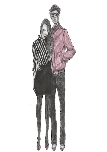 |
| My final illustration in the style of Hanna Muller which has been completed by hand using watercolour paints |
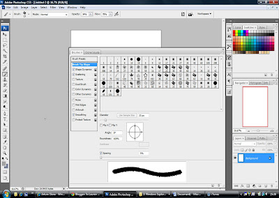 |
| Screenshot illustrating the brush set up process |
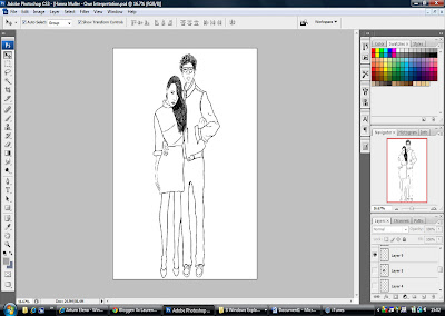 |
| Screenshot which shows an outline of my illustration |
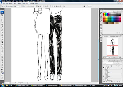 |
| Screenshot showing the colour which was painted onto the trousers and blended using the smudge tool |
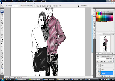 |
| Screenshot illustrating the skirt and jacket which have been painted & blended in the same way as the trousers |
I then used the same technique to to create the striped top however I had to work on the white and black stripes on different layers to prevent me from blending the two colour together when using the smudge tool.
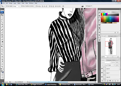 |
| Screenshot showing the detail which was added to the top |
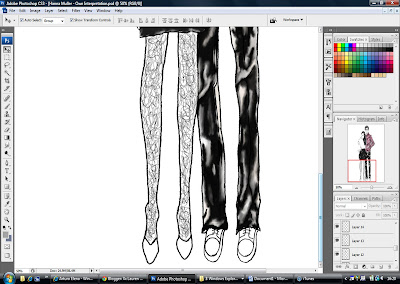 |
| Screenshot showing the detail which was added to the tights on my illustration using the paintbrush |
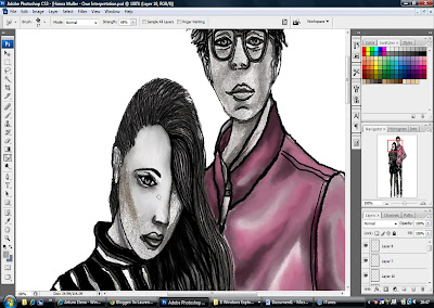 |
| Screenshot which shows the process of blending the skin tone |
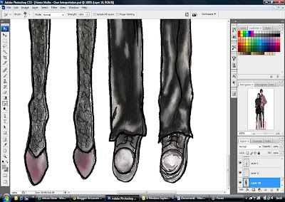 |
| Screenshot illustrating the blending of the footwear |
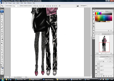 |
| Screenshot showing the illustration at maximum opacity |
 |
| Screenshot showing the illustration at reduced opacity |
My finished illustration is shown below and I am really very pleased with the outcome. I feel that I have been successful in conveying Hanna's style whilst demonstrating my own interpretation of her work.
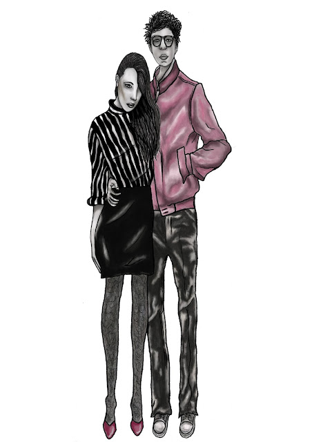 |
| My final illustration which has been completed in the style of Hanna Muller using watercolour paints and Photoshop |
What Comes Next...?
The purpose of this assignment so far has been to allow me to identify how my chosen illustrators create their designs, and put this knowledge into practice by recreating some of their work. The remainder of my assignment requires me to create 2 fashion illustrations of my own - one in the style of Hanna Muller and the other in the style of Arturo Elena, based on my previous observations of their work. Finally I will have to complete a concluding fashion illustration which demonstrates a combination of details from both of my illustrators which have been blended together in order to create my own unique illustration.
Previous Work
The three illustrations below were completed for my first year fashion illustration class when we were introduced to the "eight head figure theory" and proportion. I simply added the colour to them using colouring pencils and pantone markers. Although these drawings are quite simplistic, I like the style of the illustrations which is why I decided to create templates of them for my future use.
 |
| 1st Year Illustration |
 |
| 1st Year Illustration |
 |
| 1st Year Illustration |
 |
| 1st Year Design Range |
 |
| 1st Year Design Range |
 |
| This is my final design illustration for my 'Romantic Thrills with Frills' project from 1st year |
 |
| My final capsule collection from 2nd year |
 |
| 2nd year illustrations from my capsule collection |
 |
| This is my final design illustration for my 2nd year project |
 |
| Final design with fabric swatches and working drawing from 2nd year |
 |
| Final design created by myself & the other 2 members of my group for our Douglas and Grahame menswear project in 2nd year |
Practising Details
Both of my chosen illustrators have their own individual style and they are dissimilar in many ways however they do have one thing in common...the fact that the details in their illustrations appear almost lifelike. I therefore think that it is a good idea for me to to improve my skills a little more in these areas. I basically want to practice drawing some of the more challenging details such as eyes etc. as this should be of benefit to me when completing my next illustrations.
I began this process by completing some sketches of the hands and feet which are shown below. The hands are an essential component of illustrations, especially for Arturo Elena therefore this should allow me to achieve more realistic hand positions and proportions in my own illustrations.
Although I am aware that I will not necessarily be drawing naked feet on my illustrations, I still felt that this was an important area to cover. I often struggle when drawing footwear so I thought that this exercise would help me in the future as I will hopefully be able to imagine the position of the foot in my head.
I decided to work a little more on the realism of the hands by completing a tonal study as this allowed me to pay close attention to the small details. I had to consider the shading and proportion of the fingers which I believe should give me an advantage when drawing hands on my illustrations in the future.
I have noticed that the eyes are a real focal point particularly in Hanna Muller's illustrations however she does not necessarily use the same technique for them all. This has led me to draw various sketches of different eyes in order to practice capturing different emotions and I really enjoyed completing this work and feel that it will be very useful.
Both of my illustrators usually draw closed lips on all of their illustrations which I normally draw on my illustrations however Arturo has featured a laughing mouth in a few of his drawings. As a final practice exercise, I thought I would carry out a tonal study of a laughing mouth as I feel that this could perhaps help me if I wanted to feature a similar mouth on my next illustrations.
I began this process by completing some sketches of the hands and feet which are shown below. The hands are an essential component of illustrations, especially for Arturo Elena therefore this should allow me to achieve more realistic hand positions and proportions in my own illustrations.
 |
| Sketches of various hand positions |
 |
| Sketches of different foot arrangements |
 |
| Tonal study of hands |
 |
| Sketches of various eyes |
 |
| Tonal study of an open, laughing mouth |
Arturo Elena - Drawing Full Length Illustration
After recreating the simple components of Arturo's work, I am now going to try to reproduce one of his full-length illustrations. The image which I have decided to copy is displayed below and I have chosen this particular drawing because I wanted to challenge myself. I discovered that I was able to adapt my skills with relative ease in order to recreate Hanna's work however I feel that Arturo's will be more difficult because of the precise detail. This is the reason why I have decided to test both my hand-drawing and Photoshop ability by attempting to reproduce one of Arturo's complex illustrations.
 |
| Arturo Elena's own illustration Image available at: http://www.upkeeptheape.blogspot.com [Accessed: 24 January 2012] |
I decided that I would use Photoshop to create this illustration so I started by creating a new page in the Photoshop programme. I then opened up the image of Arturo's work & used the move tool to drag it onto my working page. Next, I set up my paintbrush and my smudge tool using number 23 and ensured that I had selected shape dynamics, scattering and smoothing. On the shape dynamics option, I also had to adjust the size jitter to 20%, the minimum diameter to 10% and the angle jitter to 10%. I then began by creating a new layer before starting to paint on the trousers using Arturo's original image which is essentially under my own work as a guide. I applied different tones and shades of red to form the illusion of shading as shown below in the screenshot.
 |
| Screenshot showing the brush set up and the colour which was painted onto the trousers |
After applying a sufficient amount of colour using the paintbrush, I then used the smudge tool to blend and create a watercolour effect. In order to use the tool effectively, I recommend that the smudge tool should be thought of as 'water' allowing you to dilute and blend your colour. I then used the same tools to create the top however I had to work on the white and red stripes on different layers to allow me to blend effectively without mixing the two together.
 |
| Screenshot which shows the colour being added to the top |
I continued to work on the illustration using the same previous method in order to create the facial details, hair, belt, shoes and jewellery and each section was built up stage by stage on new layers. I personally feel that adding these smaller details at this point essentially makes it a little easier to add the skin-tone after.
 |
| Screenshot showing the facial features which have been added along with the hair and jewellery |
I finally added the skin-tone to complete my illustration using the exact same method as before. When I was finished I was able to 'hide' Arturo's original work by deselecting the eye logo on the appropriate layer which left me with my own version of his illustration.
 |
| Screenshot which demonstrates the skin-tone which has been added to finish the illustration |
My finished illustration is shown below and I am delighted with the outcome as I feel that this technique has been successful in allowing me to create a similar result to Arturo's work. Although this technique is quite a time-consuming and repetitive process, it is definitely worthwhile and I will undoubtedly use this method again to imitate Arturo's work.
 |
| My finished illustration which represents a copied version of Arturo's original drawing |
Subscribe to:
Posts (Atom)