- Arturo's exaggerated body
- Arturo's formal clothing
- Hanna's monochrome skin tone
- Hanna's solid outline technique
- Hanna's facial style
- Hanna's hairstyle
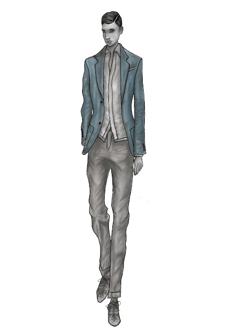
To begin my illustration, I decided to use watercolour paint as after using it on my past two illustrations, I feel relatively confident that I can use this media successfully. My finished illustration is shown below and I like the outcome however I do feel that the style looks slightly more similar to Hanna Muller's but this is only a practice so I have an opportunity to correct these mistakes for my final combined illustration.
 |
| My final combined illustration created using watercolour paints |
Having used Photoshop to edit my last few illustrations, I am going do some work to this illustration also using the programme. I began by opening a new Photoshop document before opening my illustration and dragging it onto my document. I then created a new layer and used the paintbrush tool to add an outline to the illustration. I also added some definition to the facial features as well as the hair and the shoes as shown in the screenshots below.
 |
| Screenshot showing the outline which was added to the illustration |
 |
| Screenshot illustrating the detail which was added to the footwear |
After completing all of the details on the illustration, I then selected layer 1 and used the smudge tool to blend the colour together and I used this method for the remainder of the illustration. My completed illustration is shown below and although I added slightly more detail to the illustration, I still feel that it looks like a replica of Hanna Muller's work which means that I have failed to combine my illustrator styles successfully. I feel that perhaps I have been unsuccessful because there was an uneven balance in the elements taken from each illustrator. I believe that even though I have not been able to achieve my desired result, this has been a beneficial illustration as it has highlighted what I need to alter or change in order to improve my final illustration.
 |
| Screenshot showing final combined illustration which was created using watercolour paints and Photoshop |
No comments:
Post a Comment